Every Thought Captive magazine
PROJECT GOAL: Redesign/rebrand the look and feel of a theological print magazine to better appeal to the layperson reader and sharpen the professionalism of the layout. The goal of the redesign was to create a visual style that appealed to the intended audience, was more friendly and inviting, and was compelling, recognizable, and consistent from issue to issue.
PROJECT OUTPUT: This magazine was published in print via a digital press publishing house and in PDF form.
TOOLS/SKILLS: Adobe InDesign, Adobe Photoshop, Adobe Acrobat, Adobe Illustrator, stock photography selection/acquisition, preflight and file export for printer, PDF export for digital version.
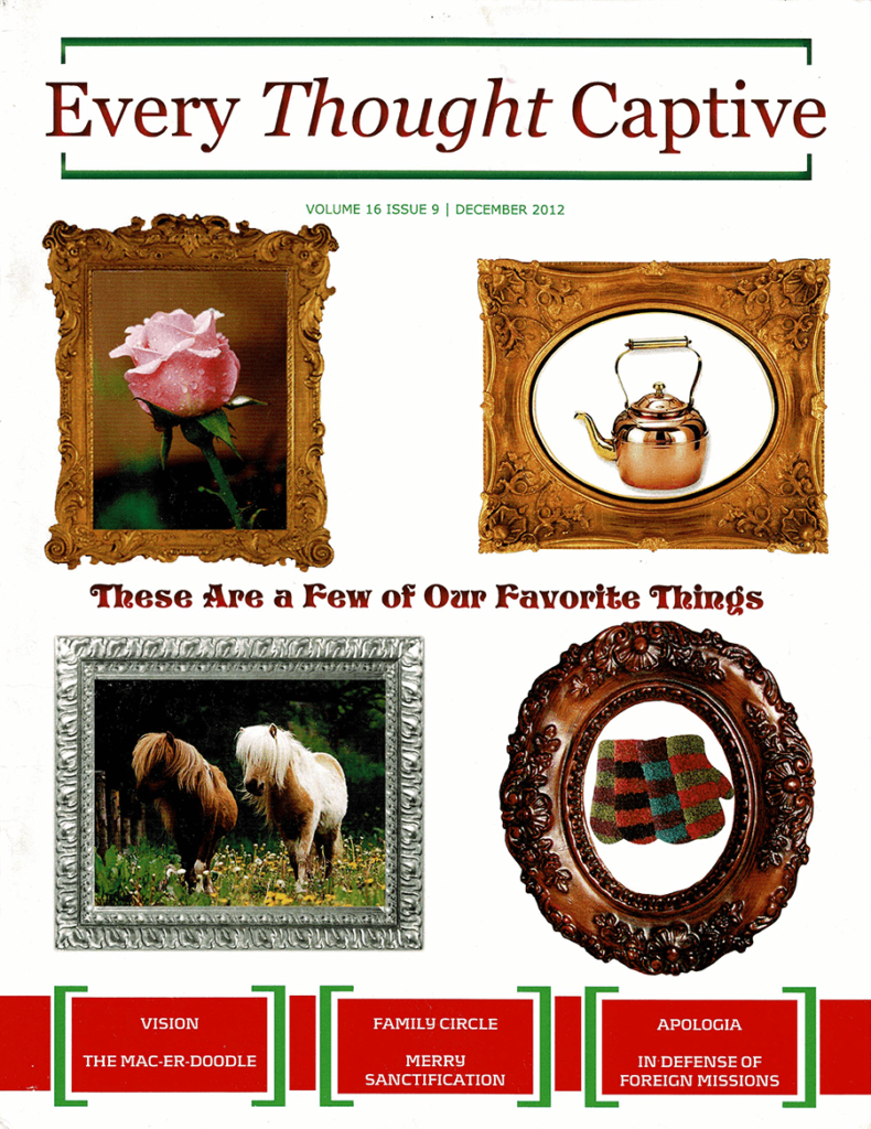
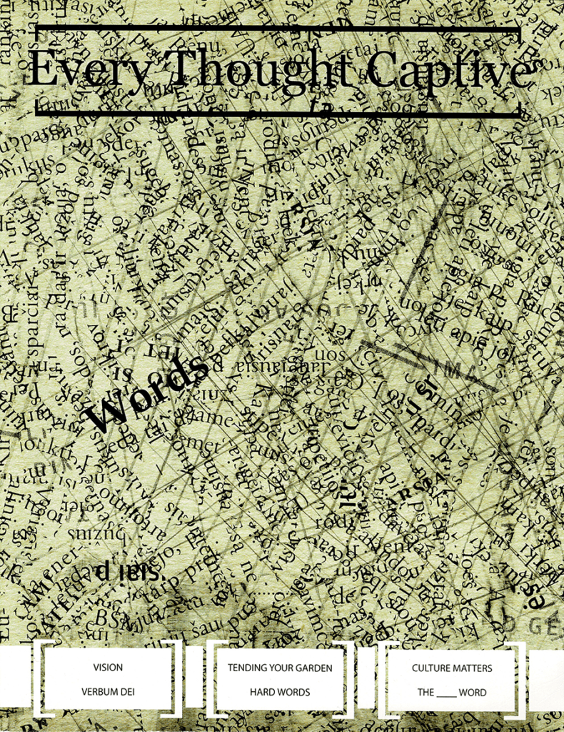
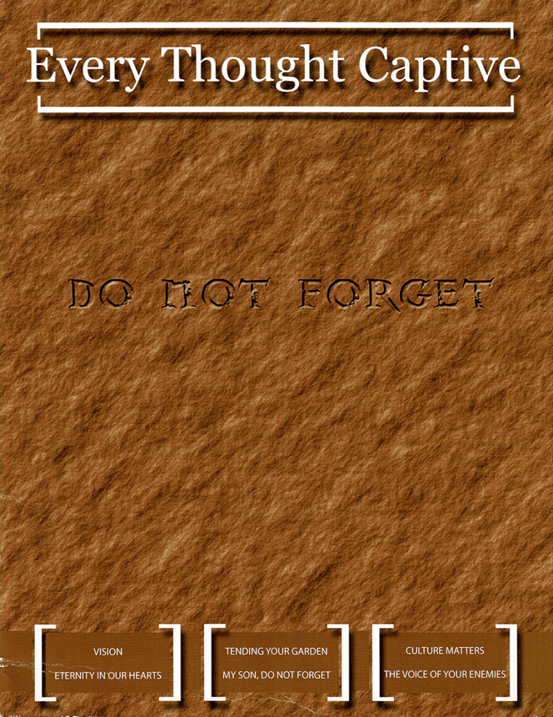
what did the magazine look like before?
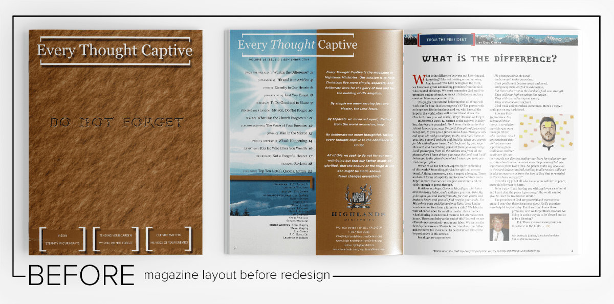
mAGAZINE cOVERS BEFORE REDESIGN
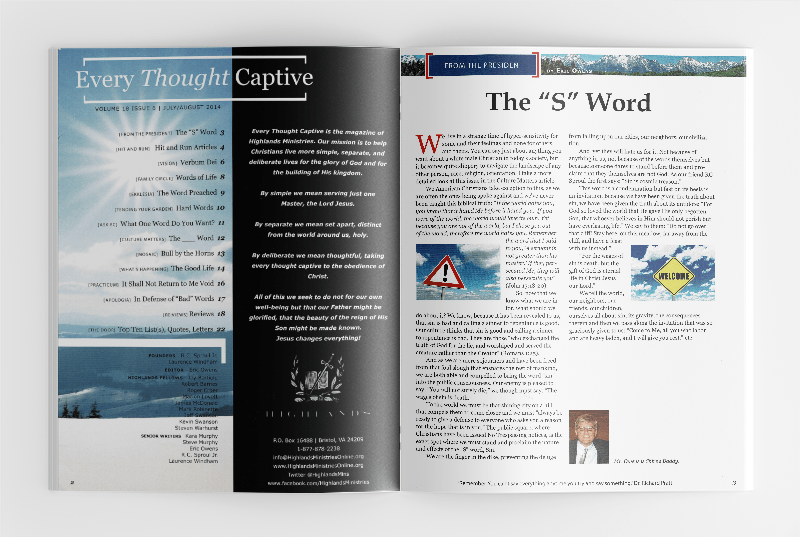
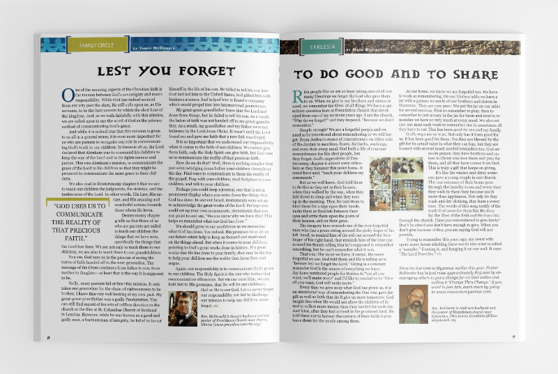
INTERIOR MAGAZINE SPREADS BEFORE REDESIGN
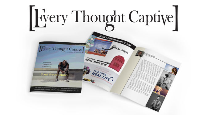
what did Magazine look like after Redesign?
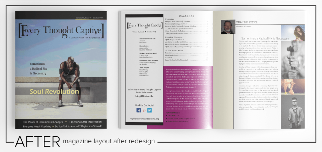
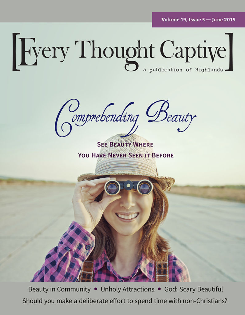
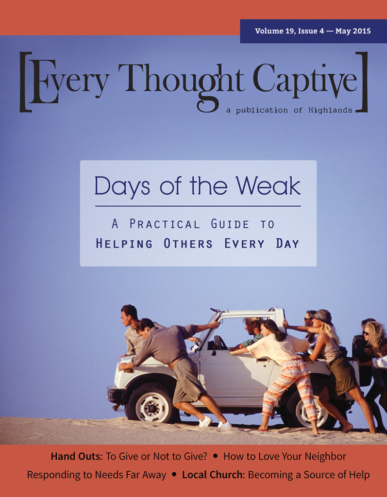
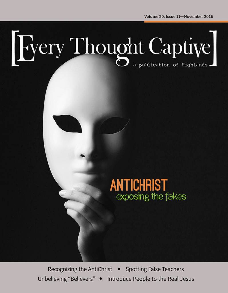
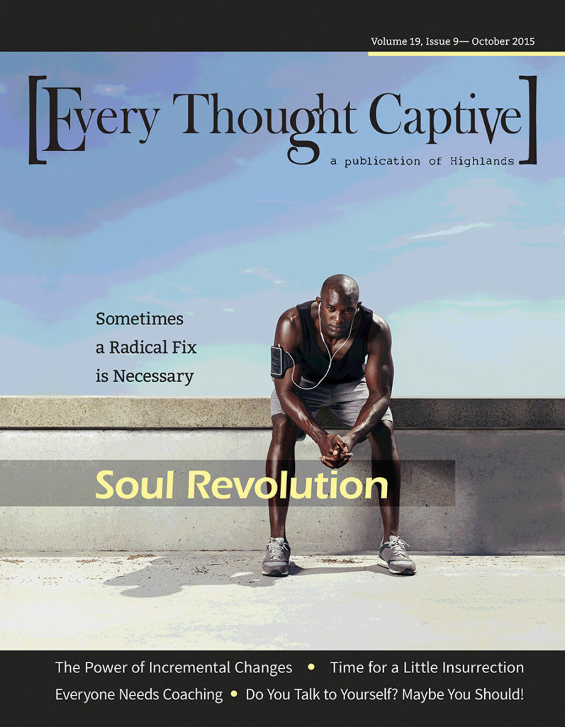
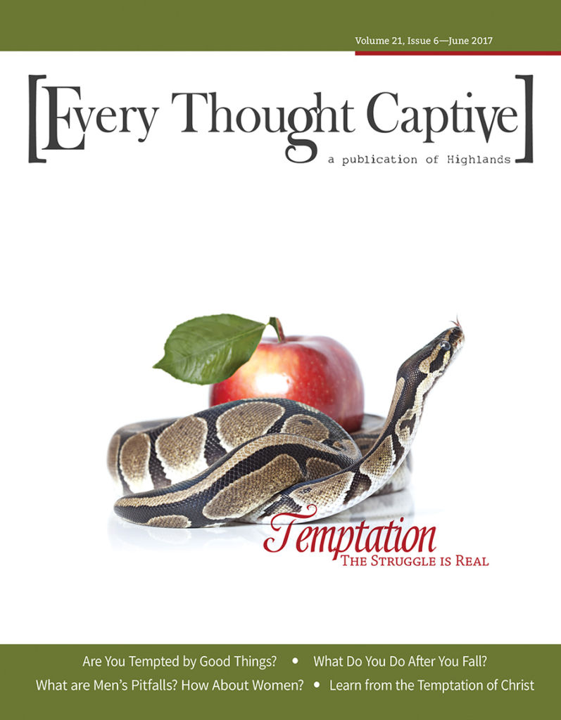
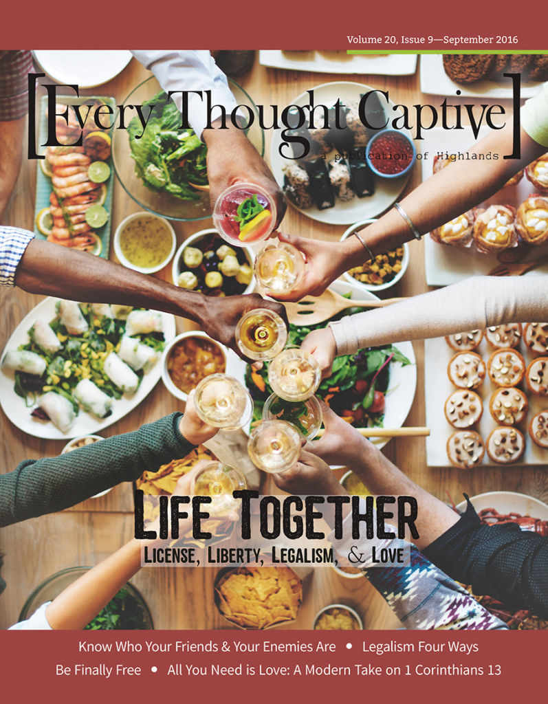
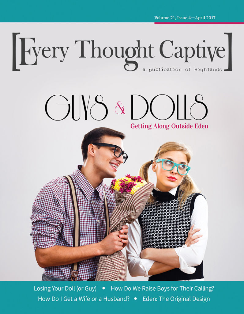
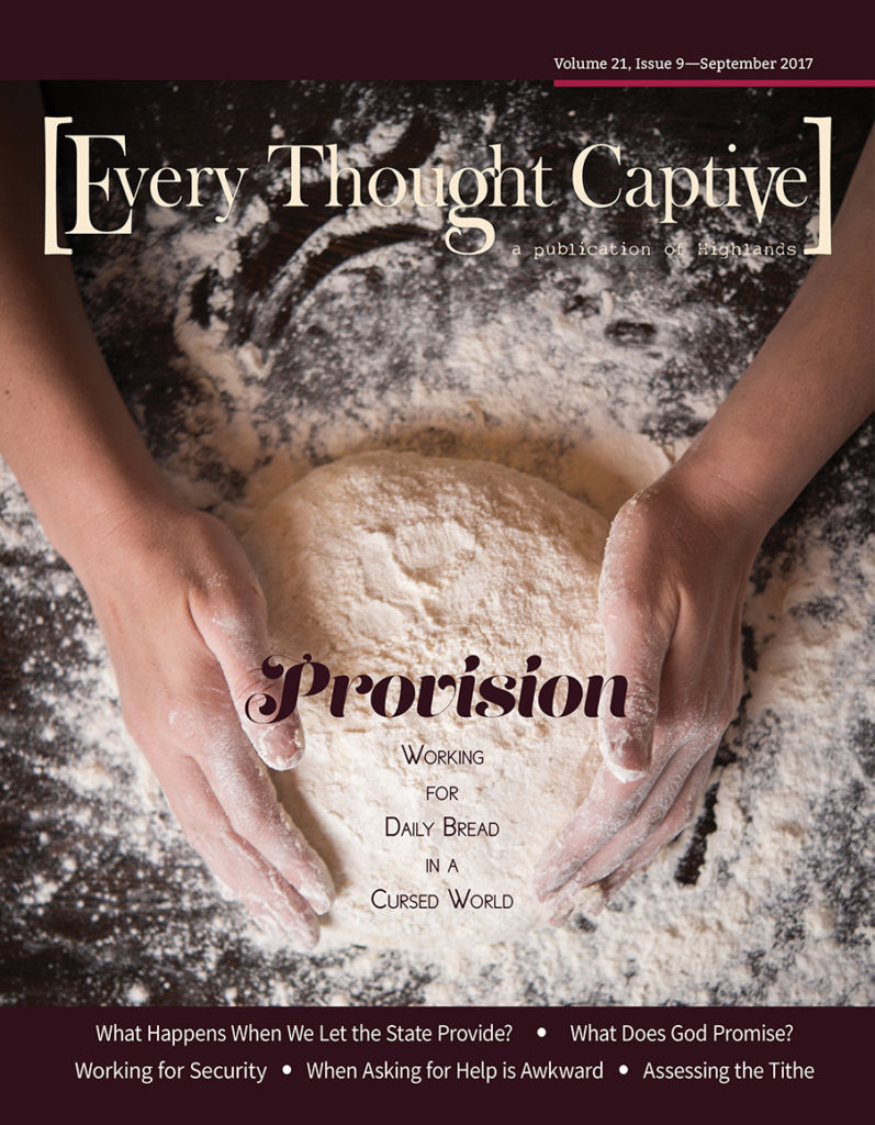
mAGAZINE cOVERS AFTER rEDESIGN
WHAT CHANGED on the cover?
- Increased human interest and movement in selection of cover images
- Cover images with a strong focal point and less background busyness
- Gave color a stronger role bringing more vibrancy and eye appeal
- Redesigned masthead maintaining a similar concept but utilizing a serif typeface with more visual interest in letter shape and editing to create some unique detail
iNTERIOR MAGAZINE SPREADS AFTER REDESIGN
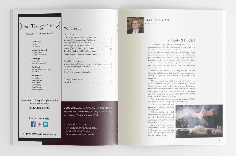
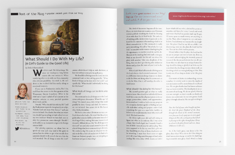

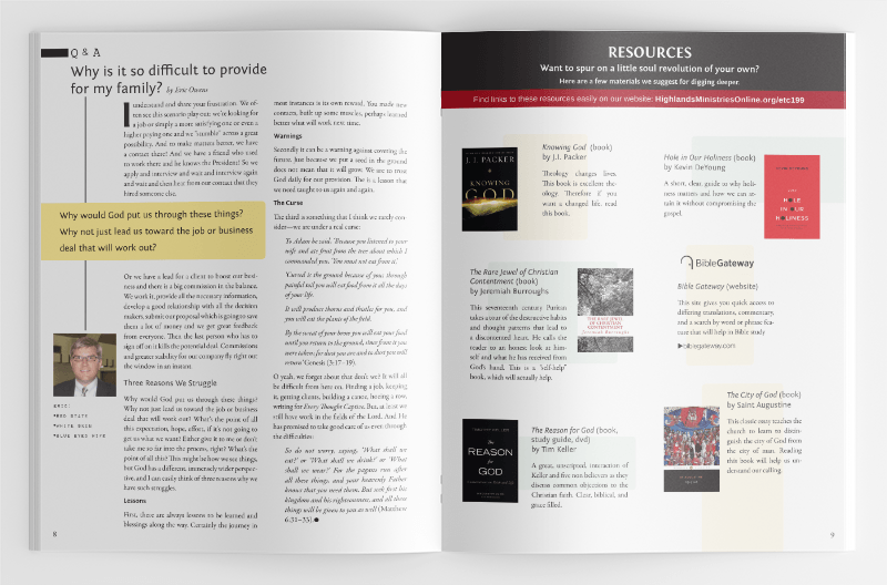
WHAT CHANGED in the interior layout?
- Cleaned up ragged body copy and adjusted text for readability and to consistently fit columns (when possible)
- Adjusted margins, gutters, line spacing, and text placement to create additional white space
- Selected fresh typefaces for body copy, dropcaps, titles, headings, etc.
- Set up consistent styles for all text elements and page headers
- Adjusted placement and style of stock art throughout
- Reduced busyness of design elements throughout
- Highlighted authors more prominently and w/ consistent style
